crass craft brewing co.
For one of my product design and branding classes at school, we were tasked with creating an original product with a memorable tagline.. in one day. Being a bartender at the time, I was always fascinated by the myriad of different types of beer, and beer label designs, that we got shipped in. There are some of the most outrageous names out there; some names I would never want to ask for, for fear of saying the name!
But that’s what I liked about them.
Crass Craft brewery
exists solely to shock people… and for delicious tasting beverages.
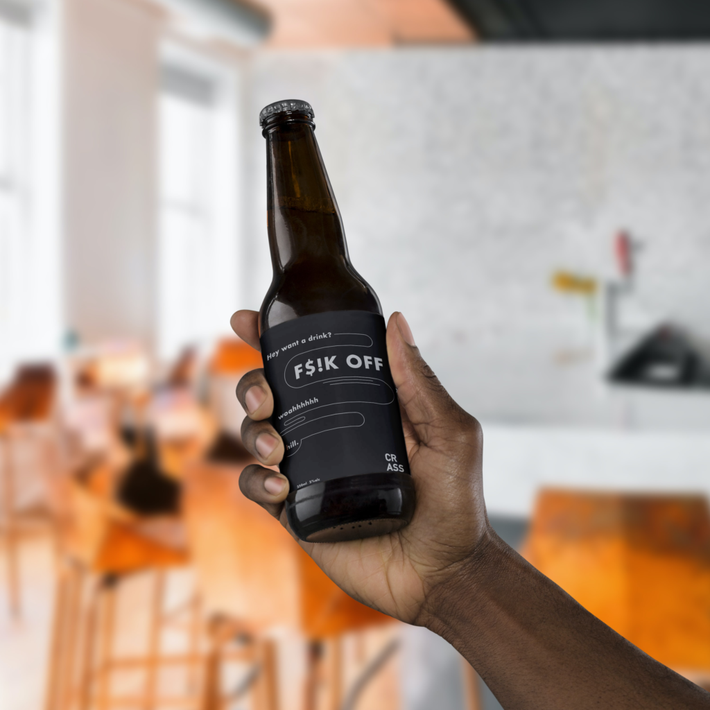
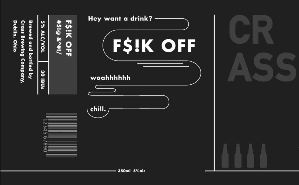
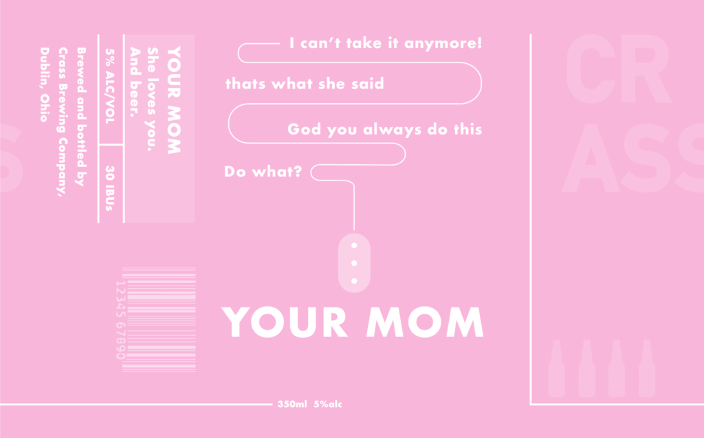
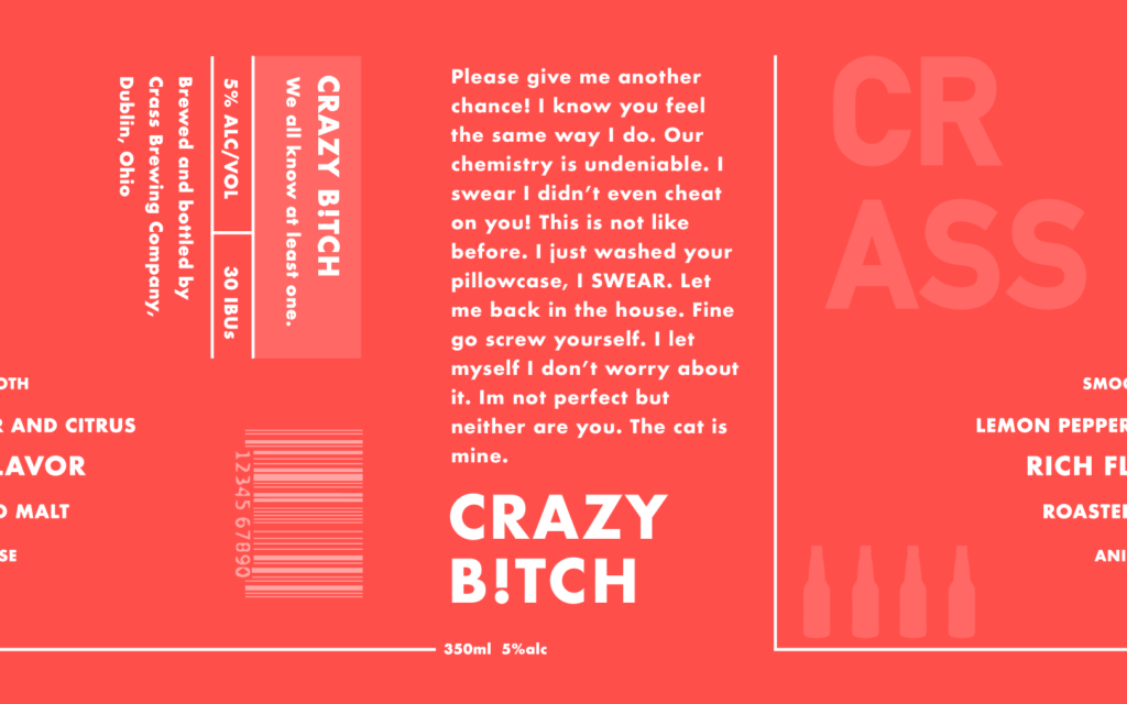
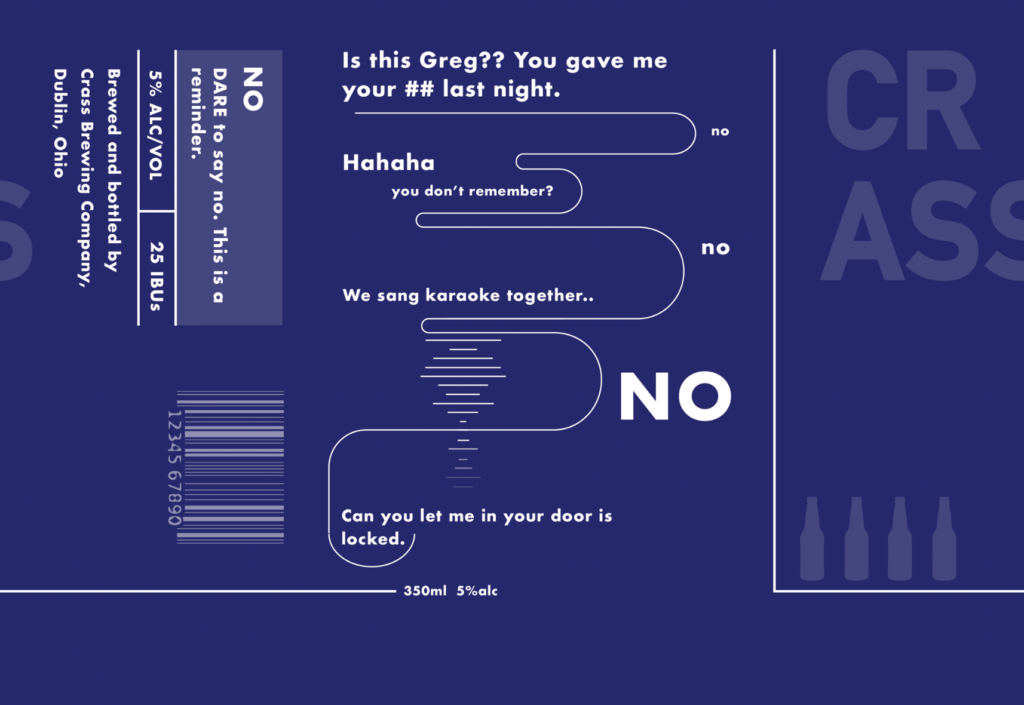
The idea being that each different type of beer would be named something that you may not want to say out loud, or a funny word or phrase. Something “crass.” Each bottle would have a conversation on it, integrating the name of the beer in a larger print.
One would be able to read the name of the beer clearly across the bar, but only once they held it in their hand would they be able to make out the entirety of the conversation.

target demographic
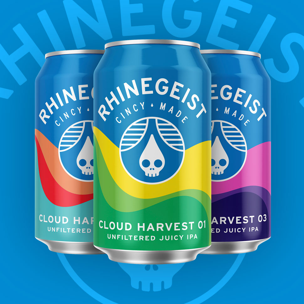
In the United States, 35-44 year olds are the most likely age group to drink craft beer. Over 50% of those people drink it weekly. Yet one of our competitors, Rhinegeist in Cincinnati, has developed a much younger customer base. That may be because its located in a city full of college students and recent grads, or that may be because of its own clever branding.
Crass is aiming for the 21 – 44 year old age demographic by being a delicious craft beverage, and also having a fun quirk about it. Starting in a college town itself, we have an upper hand at catering to a younger crowd and distributing our product amongst the many bars and restaurants.
product research
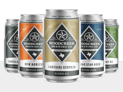
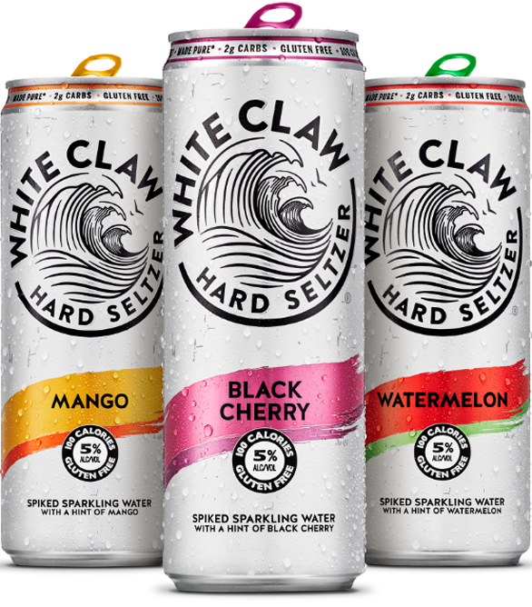
In order to translate the brand personality into a brand identity, I first had to look at what makes a great, memorable craft beer label. Traditional beer labels can be found in a green or brown color, with white or red typography. Crass is striving to go against the grain when it comes to traditional, so I opted to go in a different direction. With an alternative color scheme, Crass would seem more modern and playful.
Bifurcation is a type of deign which has become popular in the last decade. Emphasizing a clear design and brand philosophy, the label would have a consistent layout and only swap a few elements to distinguish the variety. It is effective in the case of putting your brand first and foremost. Utilizing it for consistent packaging and marketing materials, I felt that this was the way I wanted to go.

BRANDING STYLE GUIDE
Bottle laBels
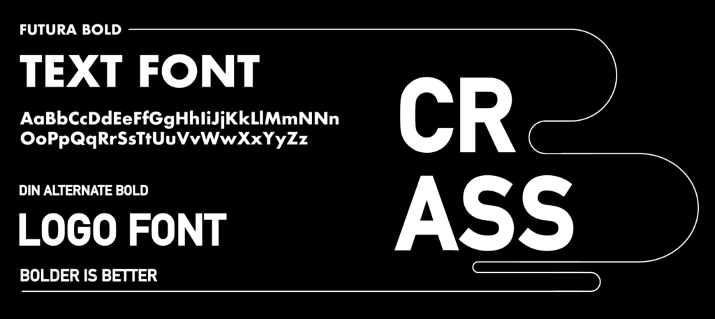
I developed four different bottle labels for four different beer types. The simple block, sans-serif fonts of Futura and Din Alternate provide an easily readable text. Because there is so much text on each bottle, simple lines guide the eye along, without making it too crowded or confusing. They emphasize certain parts of the text on purpose. The colors are bright and vibrant, as to stand out amongst the more decorated traditional labels.

mockups

Marketing posters
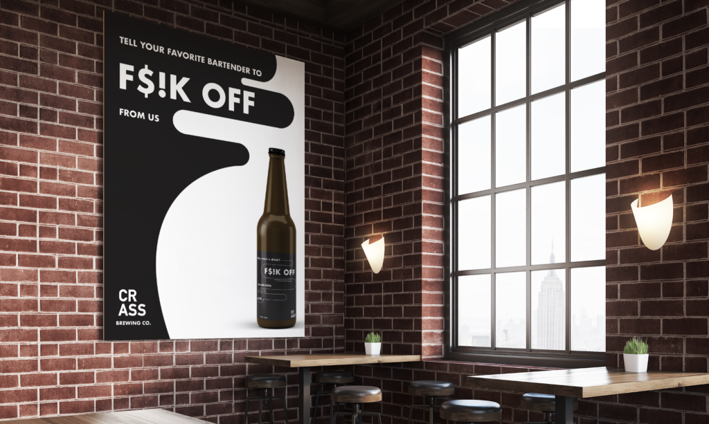
Bars are constantly getting sponsored by beer or seltzer brands. Posters, banners, and merchandise are constantly flowing through any and nearly every bar. The brand could be advertising a new flavor they have coming out, or a seasonal rebrand launch.
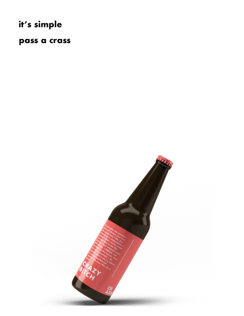
I made use of some of the slogans and puns I came up with to help advertise through posters. The Crass bottle labels’ simple design is reflected in the first poster. Utilizing white space to my advantage, the eye is immediately drawn to the bottle. It simplicity is enough to draw a viewer in and capture their attention.
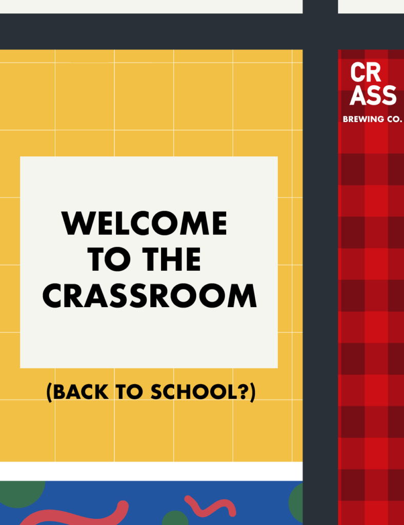
The second poster would be used in college bars or restaurants, specifically after a break. It’s more crowded, but its bright colors and patterns allude to fun and excitement.
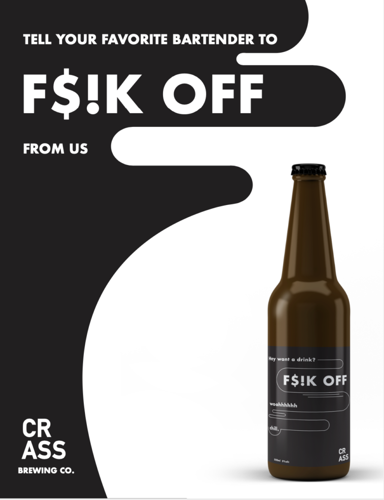
The third poster is reminiscent of the physical Crass beer label itself. Utilizing the same colors and techniques as the beer it’s promoting created a cohesive and satisfying vibe. It’c calling out directly to the viewer.
