Skipper's Pub
website redesign: a UX research analysis
(text heavy I know but thats research for you:)
the problem
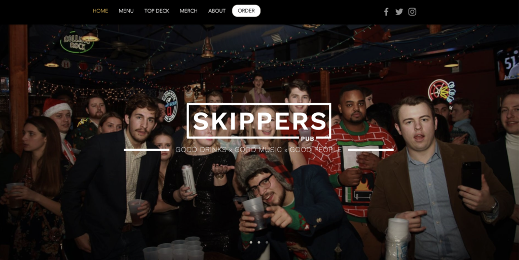
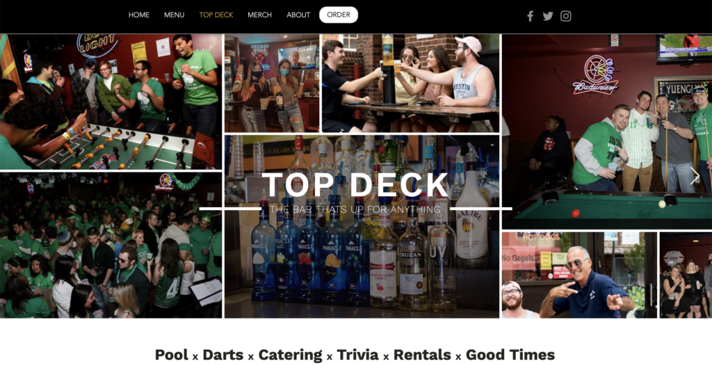
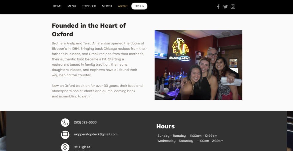
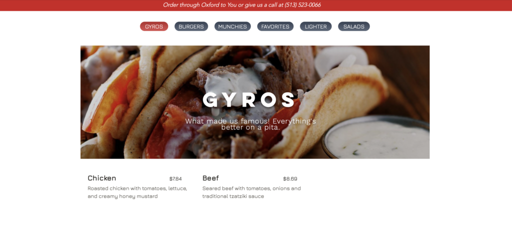
their current website
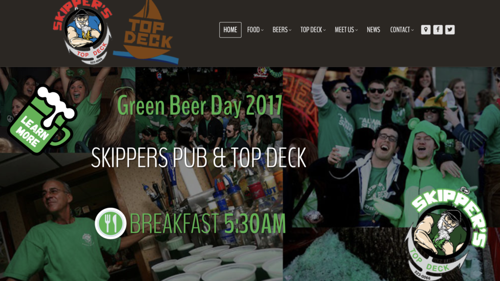
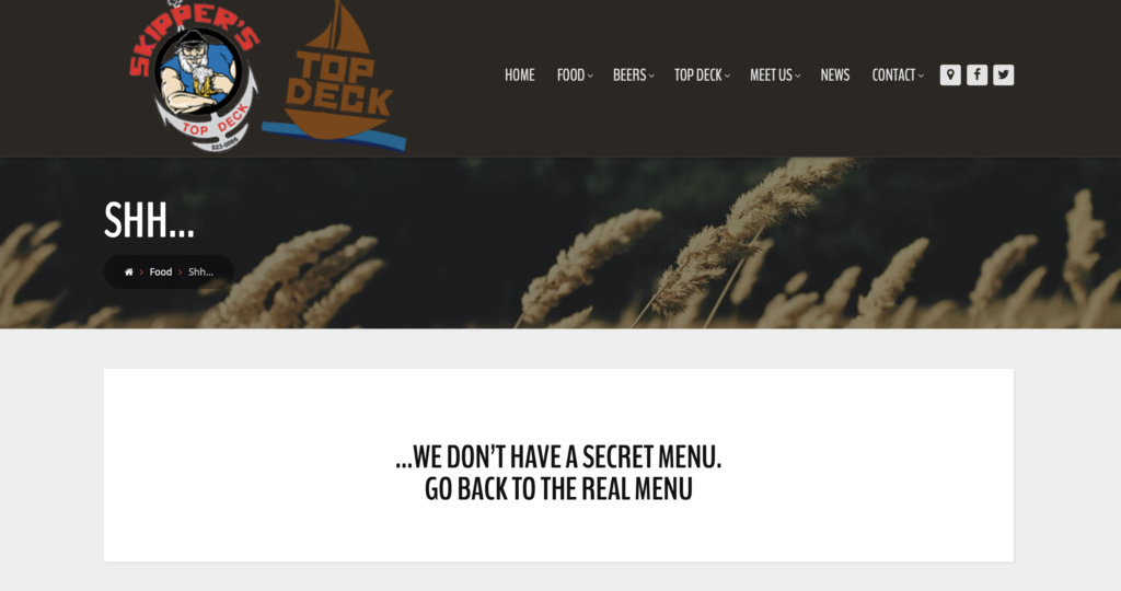
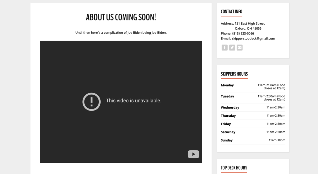
Websites are a staple of any business if they want to be found by a larger and broader audience. Because Skippers is smaller and localized, they have neglected to update and use their current website. Many smaller businesses may not have the funds or know how to keep a website up to date and functioning for their target user, and I feel as though this is what happened with Skippers.
Websites drive traffic, promote the brand on a different more broad platform, and increase customer loyalty.

the goal
My goal going into this project was 3 fold: to create a website that is inviting, informative, and stays true to the brand as to keep that customer loyalty.
I will be successful if the website is able to provide both consumer and corporate value. Working with both the target customer as well as Skipper’s is essential in order to curate the best possible experience both parties can have.
literature review
Hak-Seon Kim in, "Assessing the Quality of A Restaurant’s Website Using DINNEWEBQUAL"
Previous studies have identified a positive and significant relationship between the use of information technologies and the development of a competitive advantage.
Young Namkung in, "A Grounded Theory Approach to Understanding the Website Experiences of Restaurant Customers"

competitive analysis
I focused my competitive analysis on the local restaurants and bars surrounding oxford, because they are Skippers direct competitors.
Oxford restaurants in general tend to have more unprofessional or unfinished websites, but on most of them you have the ability to order online or at least are linked to a secondary source where you can order online.
This is such a strength restaurants’ websites can have and one of the things that most people are looking for when looking online.
surveys
Defining Audience Parameters Survey
I sent out an initial survey to people around Oxford to see what different types of ages, backgrounds, interests, and knowledge of Skipper’s existed within the people who were most likely to go there.
99.9%
59.1%
People of this demographic go to restaurants’ websites to either look at the menu or order online.


OBSERVATION
Inside Skipper's: Real Time Customers
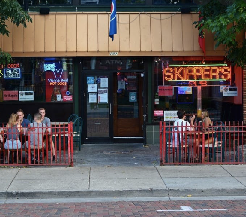
The demographic of most of the people I saw and interviewed lined up with my survey, some skewing younger. 83% said that they went to restaurants websites to look at the menu and compare prices. They all were very familiar with Skipper’s and the majority had visited the website. When asked what they thought about it, some stated that it seemed “pretty cool” but didn’t have much substance on it.
target customer
persona
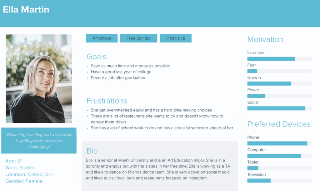
Ella is your typical college student. It’s her senior year at Miami and there are still so many restaurants to try and so many things to do. She needs to save time and money, so she often orders from a variety of places around town. She likes going into Skipper’s, but never knows what to get because she can’t find the information online.
customer journey map
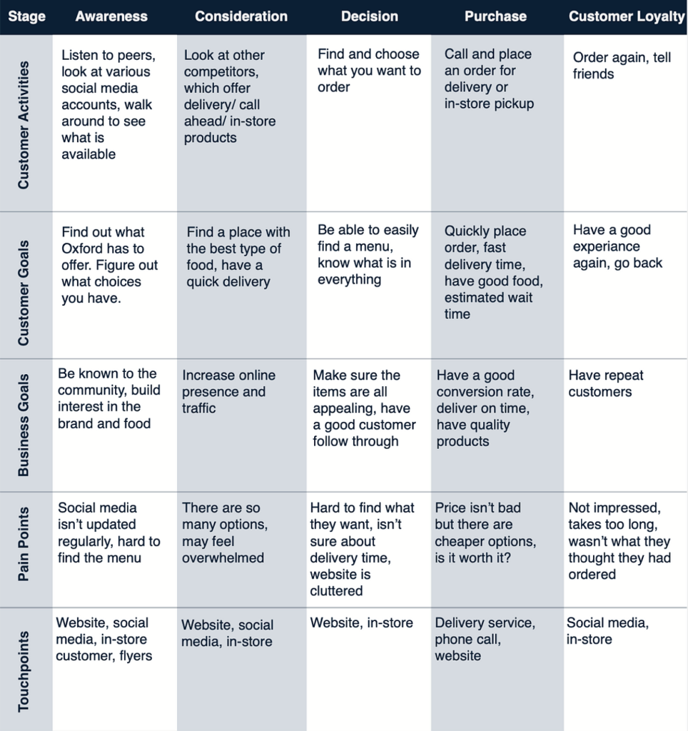
Using this persona and research gathered from my survey, I was able to complete a customer journey map to see how customers experiences meet their expectations and find those areas where design may need to be improved.

user interviews & use cases
I interviewed 5 different target customers in person using the criteria I had gathered from my initial survey. I asked my participants to complete three basic tasks on the current website:
- Order food
- Rent out the restaurant
- Find out more information about the restaurant
pain points
lack of information on menu
no way of ordering
hidden navigation
outdated
points of contention
Users liked the vibrant colors and information present on the homepage, but felt it was not consistent throughout the rest of the website. They liked seeing the daily specials and events, but felt it was outdated.
Coming out of this research phase, I knew that the menu and navigational hierarchy were two of the most confusing and least user friendly parts of their website. These were the two main sections I was going to have to do further testing on.

design tenets
The current website doesn’t have a consistent visual hierarchy, which leaves people confused and wondering where to find information. I really wanted to focus on making the new website a better overall user experience, and that starts with making sure the layout and organization makes sense.
Keeping it fun is a tenet more specific for Skippers brand. It’s a college restaurant and bar with college kids who staff it. The atmosphere is very chaotic, fun, and welcoming. I wanted to make sure to carry this over onto the website.
WIREFRAMES
NAVIGATIONAL HIERARCHY
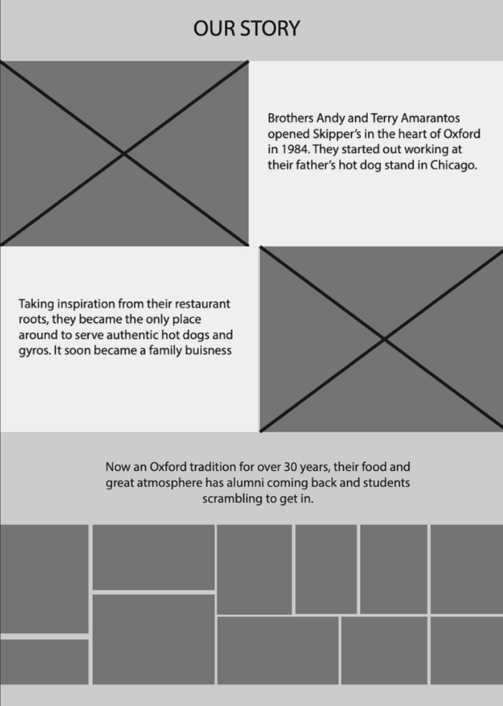
I sent out a virtual card sort study in order to better understand where potential users might group the content I’m planning to include, and see how their logic may differ from my own. I actually did revise my navigational hierarchy a little because of this. I didn’t necessarily need a whole tab dedicated to contacting when most people grouped the contact tab under the home tab. They created their own tab, About Us, (which I didnt even have as a tab before). Their current site doesn’t give much information about the restaurant or the people behind it and according to the card sort study, participants may have wanted this information.
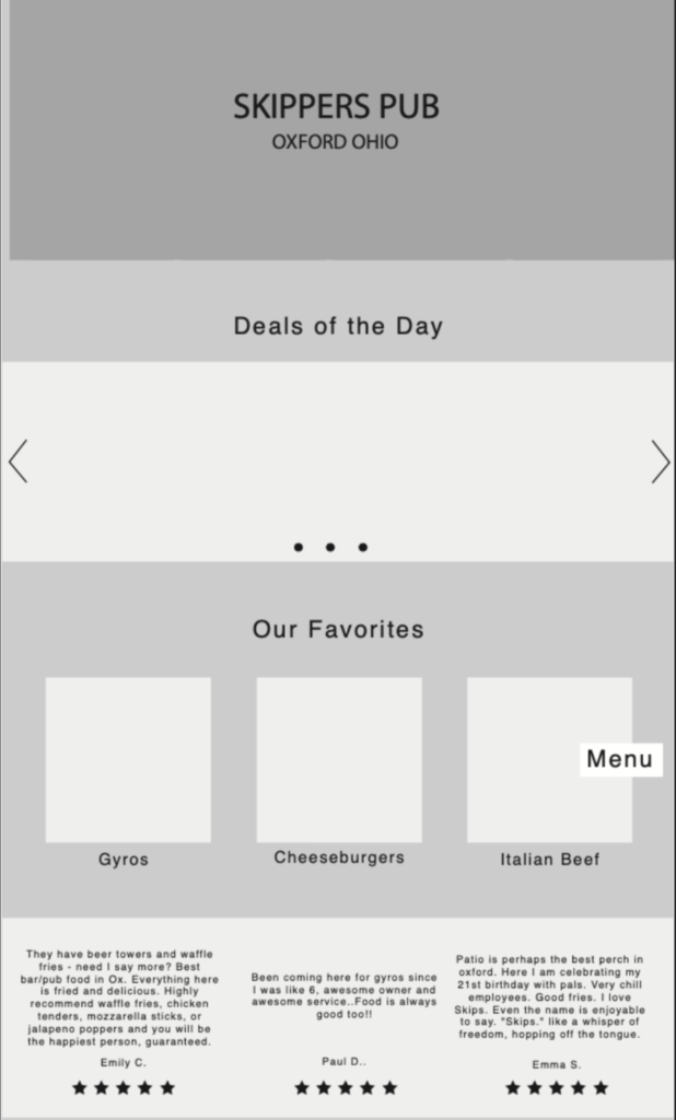
a/b testing menus
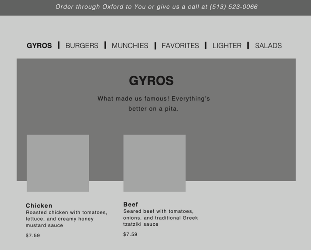
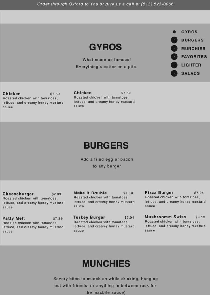
Because menus were a priority for Skippers’ target demographic, I wanted to make them as intuitive and as user friendly as possible. With all of the new information I was planning on adding, I needed more perspective to make sure it wasn’t going to be cluttered. I wireframed and designed two separate menus, with the hopes of getting clarification from real customers.
During a/b testing in the wireframing phase, the majority preferred the navigation at the top. I went ahead and mocked up both websites, just to get further confirmation. Users said the top navigation looked more organized and it was simple to navigate.

final mockups
